COYZY | September 2021 - 3 months to release the first version of the new app.
Improving the experience of the mobile safety app.
Role.
UX researcher, UX designer, Strategy, Planning, Management and Design System.
Tools.
Figma, Miro, Google presentation.

COYZY is a service that has all the tools people and their loved ones need to prevent, face and overcome dangerous events during everyday life.
Whether you simply want to ask for immediate help or just let your loved one know that you are safe COYZY lets you do all of that with a simple tap!
On COYZY people don’t just get help, people are part of the community that acts for a safer society.
Still, the old version of the app experience had significant usability and quality issues, which came to light during the development stage.
The goal of the project was to identify problems and possible changes which would lead to improving overall experience and generating retention and engagement while not creating a huge development lift.
I seemed to be a great fit for COYZY challenge because of my recent UX professional diploma, as I could adopt my knowledge to identify the problem and get experience with designing a mobile app.
A service to receive and give help



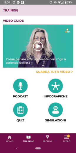
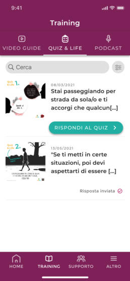
Prevention. Build prevention through video guides and gamification.
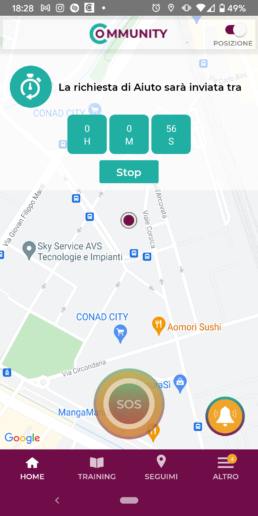
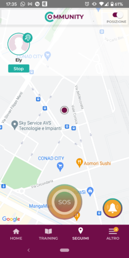
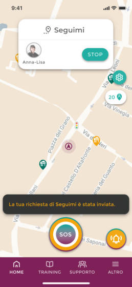
Support. Assisted SOS, timer, watch over me and I’m safe, a toolkit for your safety.

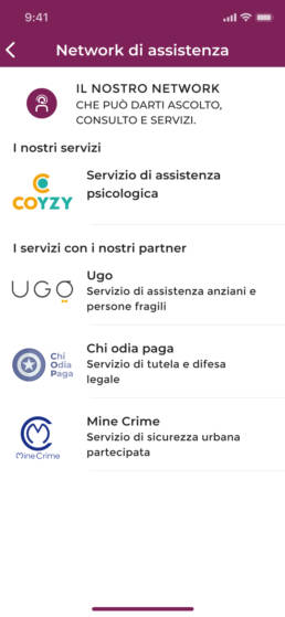
Assistance. Equipe of professionals by your side to ask for help or suggestion.
Process.Timeframe.
It has been (and it’s still being) a really exciting project for me to work on as it provides real value, involves a ton of analysis, and detailed interaction work. However, shifting priorities and changing roadmaps have delayed the launch of the app. I learned some important takeaways from this project related to the product and start-up business processes.
COYZY app is currently in the development phase.
Goals.
As a designer on the Coyzy project, I took over all the aspects of the app design and started by comparing the first version of the app with direct competitors and also apps focused on wellbeing. I redefined the new architecture information and both the high-level flow and the user flows of each feature, sketching the screens to fix the issues uncovered in the research, iterating the prototyping phase several times.
I defined and annotated all the necessary details creating the wireframe to update the UI and for the developers to build the new app without trouble.
Learnings.Key takeaways.
Adapting to changing requirements. Unexpected issues, new deadlines, and reprioritization force the scope of the project to constantly change. I had to adapt to these changes and still deliver the best design in time with tight deadlines.
UX first. I worked under technical and budget constraints, but still, I went ahead to fight for what I believe is essential for the best user experience.
The importance of a good MVP. I learned what makes an MVP great and the impact that it can have both in testing ideas and also in generating excitement and traction.
Don’t deliver weak material. I learned how to define a real MVP versus something that is simply not usable and therefore not deliverable.
Being selective. There were many interesting use cases we could tackle to create a rich feature set. However, some of them were going to increase the complexity too much or be very costly and not useful. I had to determine where the real value was for COYZY is so that we did not spread ourselves too thin.
Full process deck
Understand
Heuristics review.
Before any changes to the existing design and digging into visuals and direction, I have decided to identify what’s working and what’s not from an interaction and usability standpoint through heuristics review.
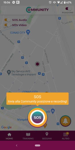
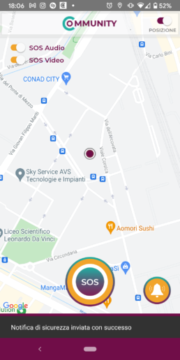
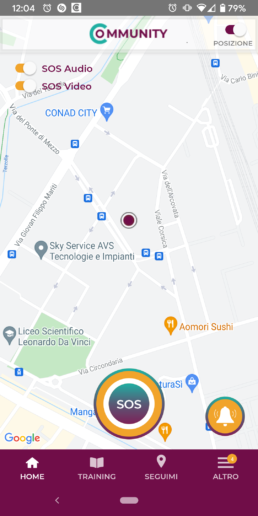
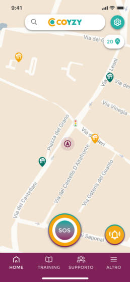
The before and after of the SOS feature. Lack of interaction and system feedback.
Understand
Competitive Analysis.
Research of leading apps in relevant industries. Identifying patterns, ideas and inspiration for the innovation of the COYZY app.
Findings.
The key insights I gained from my research include:
Pain points. Chaotic information architecture; Lack of education around features and ah-ha moment in the onboarding; Inconsistency between shapes, shadows and colours; No engagement to be part of the community; Lack of feedback while users ask for support.
Behaviour. Habit and motivation forming through gamification, interaction and system feedback; Focus on users feelings.
These insights allowed me to further define the project problem.
Design
Information architecture.
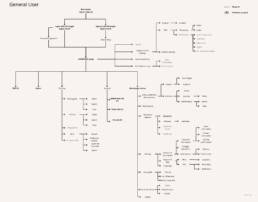
After I identified the critical areas of the old version of the app and gathered inspiration from the market, I started reviewing the navigation into the app on how to design a smooth and pleasant experience for the users and thinking about potential features of the product using the information architecture.
Design
Flow diagram.
I re-defined the high-level user flows for the main features of the app based on the previous research and the storyboards. Then I translated my sketches to a digital format using Miro, to share and discuss them with the rest of the team. During the translation, I iterated over the flows as I worked and learned more about the user journey.

Design
Interaction design.
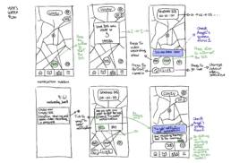
When I first started the design phase, I had lots of ideas and possible variations for every component. To sort them out I decided to begin with high-level sketches to get them roughly on paper before diving into the details.
Recognizing the need to simplify the SOS pathway, I explored options where the share location and recording were combined in one view. Trying to minimize the amount of information in the notification system to make it less overwhelming, I also tried to increase the involvement of the community through gamification.
Design
Visual System.
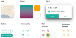
The timeline was very tight and I had to focus on prioritization. In terms of visual design, the decision I made was to maintain part of the previous visual, as the core of the project, and improve it by merging it together with more rounded shapes and a new iconography in a more harmonious system aimed to communicate serenity and be more intuitive to the end-user. New colour sparks are added into the system starting from the map colour setting.
Layout. A Friendly and Safe Place. Open, Light and Inviting.
Tone. Freshly Courageous. Positive and engaging energy all around.
Design
Hi-Fi Prototype.
After throwing ideas and flows onto paper, I began designing variations in Figma. I would show the designs I was most confident about to my team, then get feedback and go back to the drawing board for another iteration on the designs.

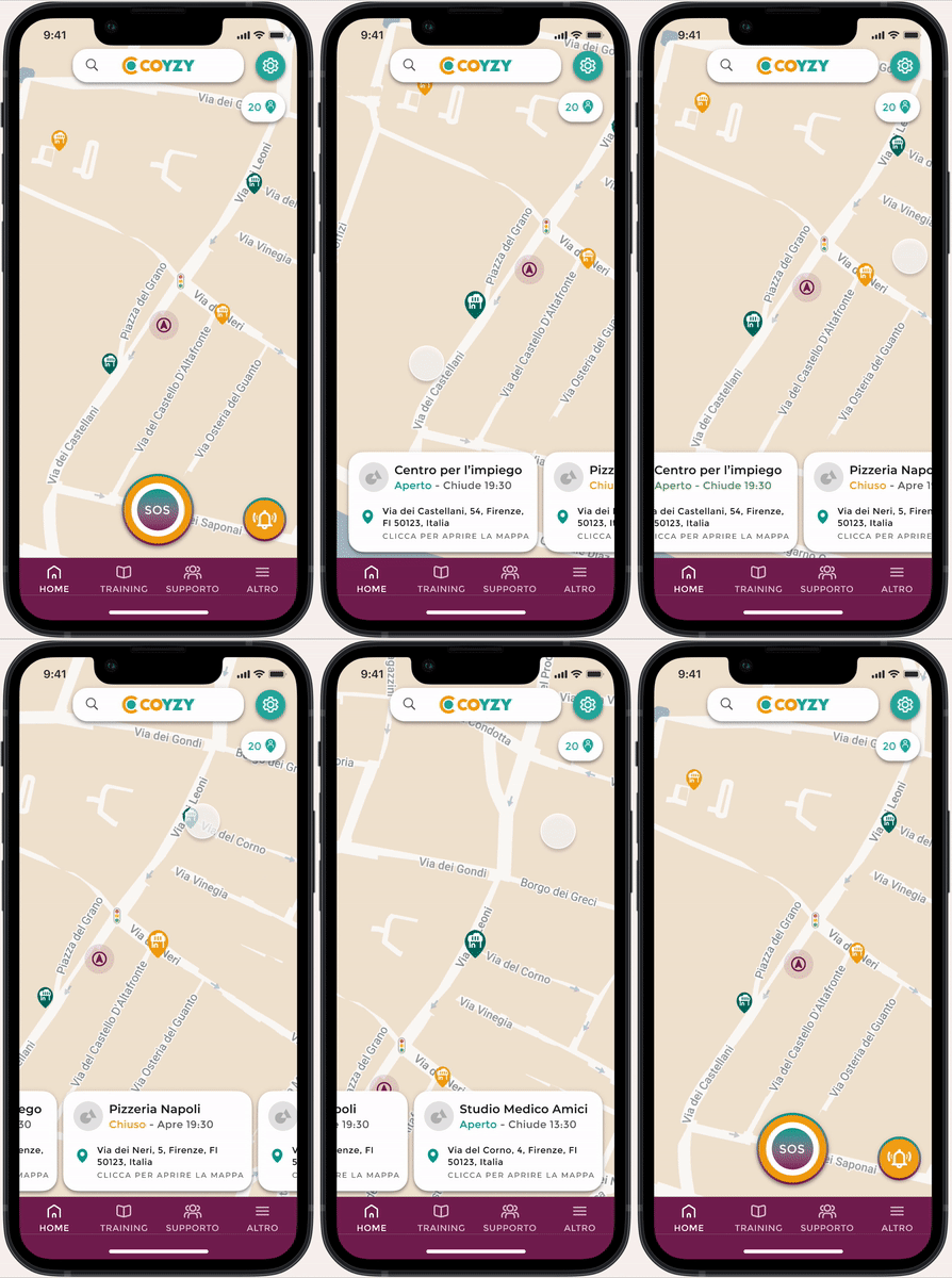
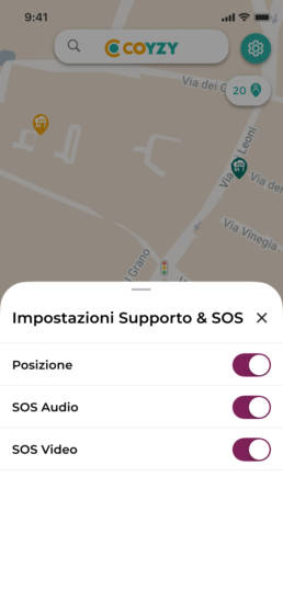
Interactive map. Check the nearest Safe Point and feel safe with the users from the community around you.
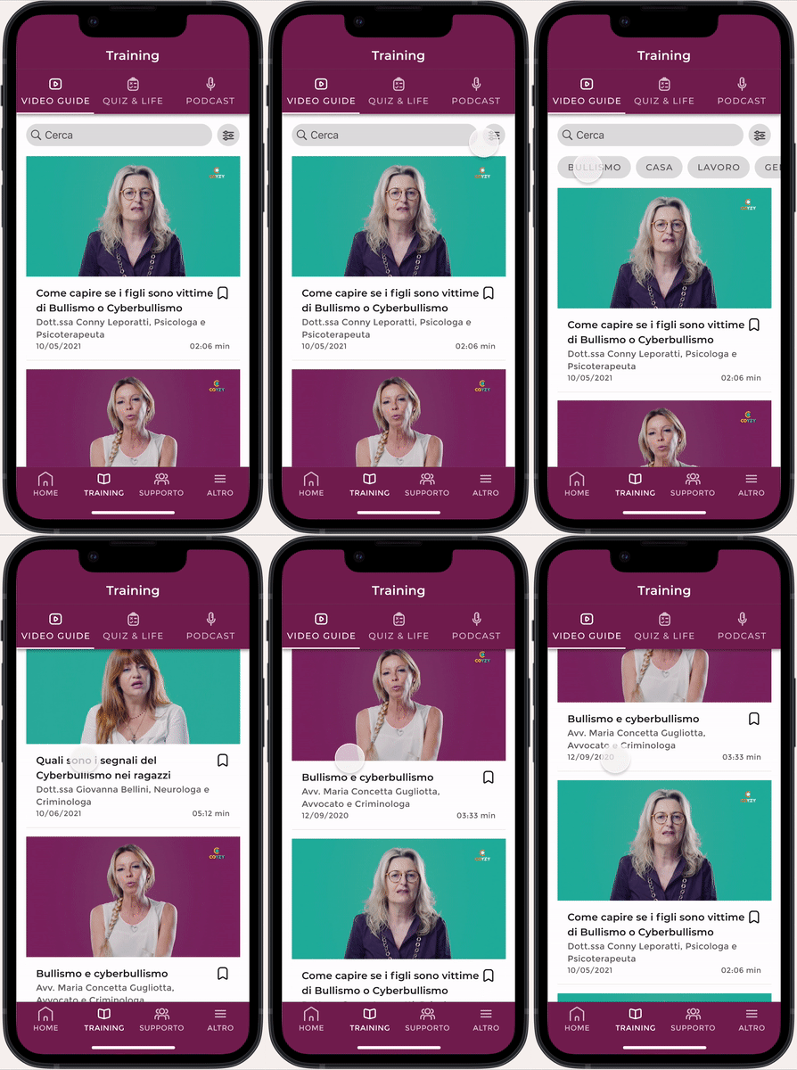
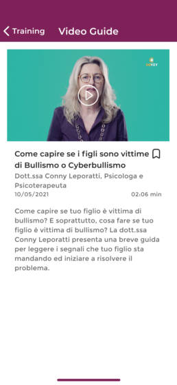
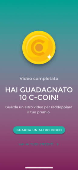
Learning. Build prevention through video guides and gamification.
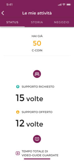
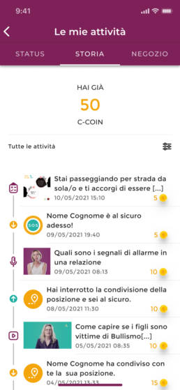
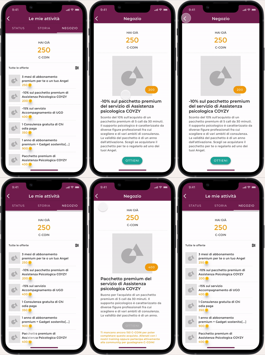
Gamification. Involve the user with credits for good behaviour.
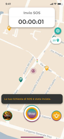
User A. Send the SOS.
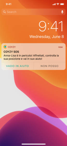
User B. Receive the SOS.

