

Sainsbury's
SmartShop Refresh
Lead Experience Designer · Sainsbury’s SmartShop Android Handset · Mar 2026
Improving the in-store digital shopping experience for ~2M customers each week while preserving their habits
For over a decade, SmartShop handsets have helped customers browse aisles, scan products, and manage their spending as they shop. Over time, the experience became deeply familiar, with customers developing strong habits and expectations around how the handset works.
The challenge wasn’t creating something new. The challenge was evolving something people already trusted.
As SmartShop approached its 10-year anniversary, we saw an opportunity to refresh the handset experience, bringing it in line with modern accessibility standards, contemporary interface design, and the evolving SmartShop brand whilst preserving the confidence and familiarity customers rely on in-store every day.
Designing for Familiarity
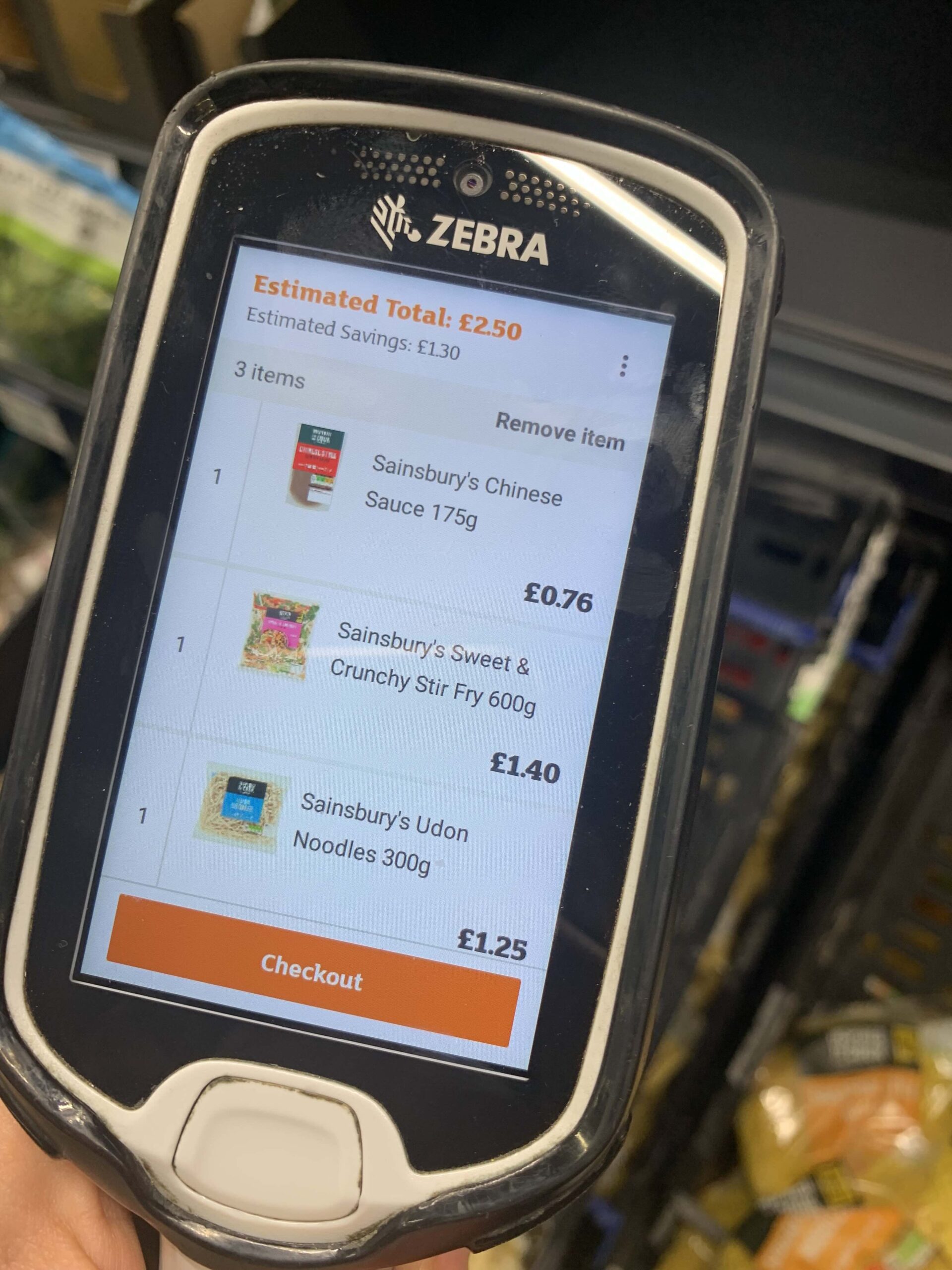
Most digital products can assume a learning curve. SmartShop could not.
Customers use the handset while moving through stores, making decisions quickly and dividing their attention between products, prices, baskets, and their shopping list. Any change to the experience risked interrupting established behaviour.
Our goal was not to redesign the journey.
Our goal was to make the journey feel clearer, lighter, and more intuitive without changing the mental model customers had already learned.
This principle guided every design decision.
Inclusivity without compromise
Accessibility as a foundation for all
Guidance without interruption
Using motion, sound and feedback
Creating Clarity in a Fast-Moving Environment
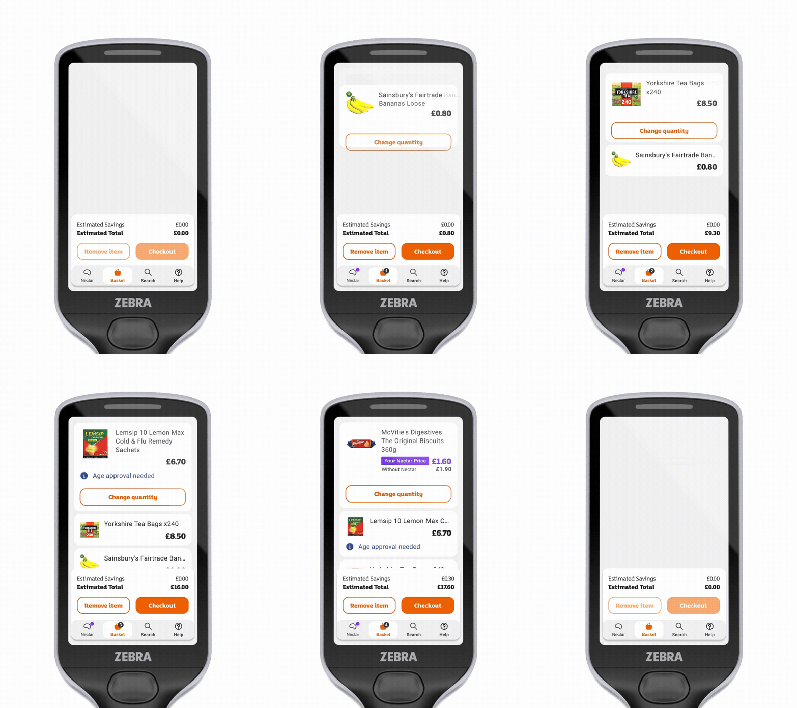
Unlike a mobile app used on a sofa, SmartShop exists in a busy retail environment.
I focused on reducing visual friction by introducing:
- clearer information hierarchy
- more consistent layouts
- simplified visual patterns
- improved readability
- stronger emphasis on key shopping information
Rather than drawing attention to the interface itself, the redesign aimed to fade into the background, allowing customers to focus on shopping.
Creating a Visual Language for Confidence
The previous experience had accumulated patterns and treatments over many years. While functional, the interface lacked a cohesive visual language.
The refresh introduced a more consistent system of typography, colour, iconography, and spacing, creating a cohesive visual language that doesn’t compete for attention.
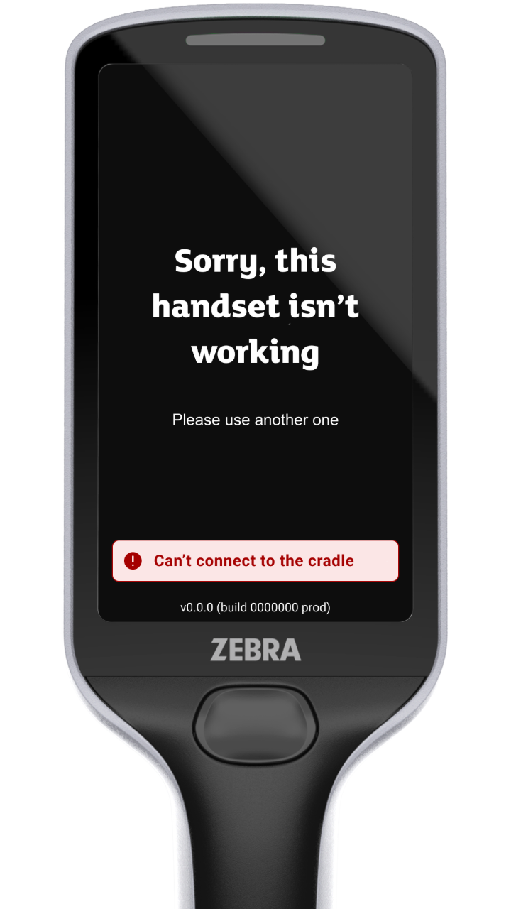
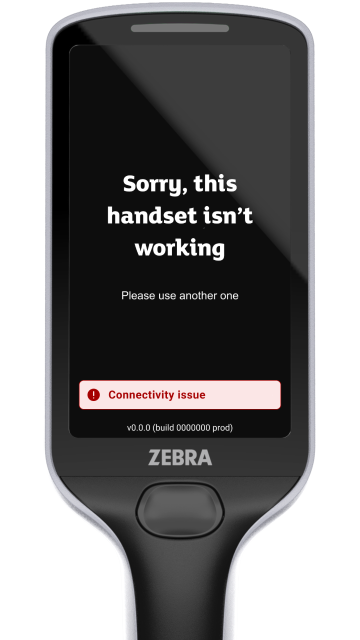
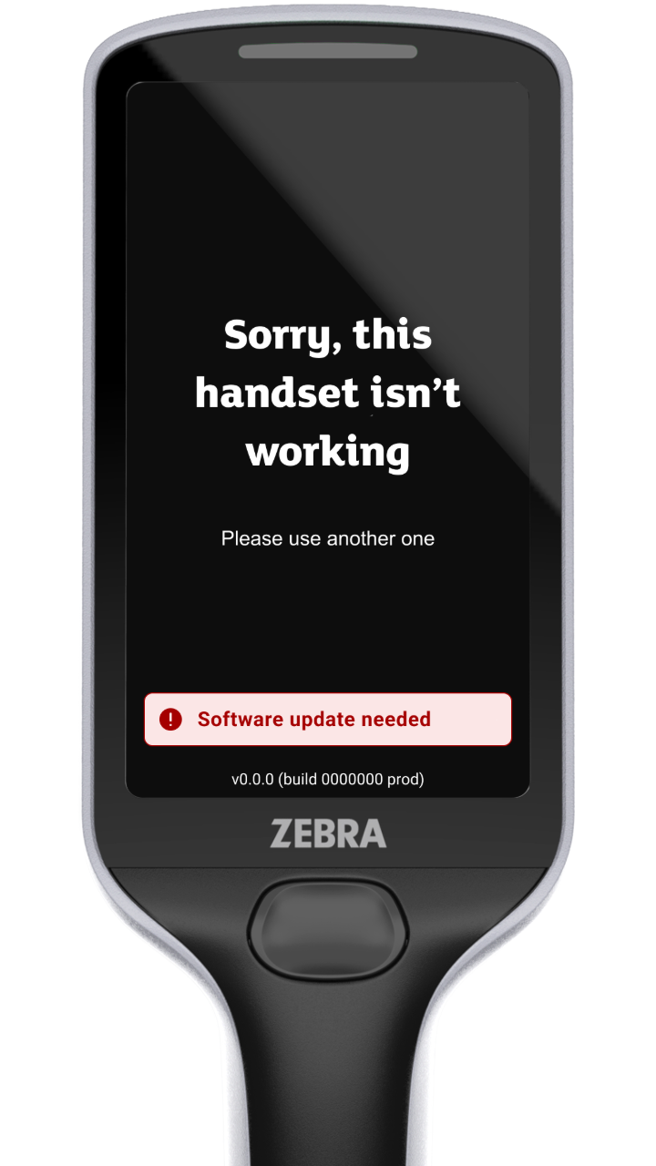
Accessibility as a Design Foundation
Unlike a personal device, the SmartShop handset cannot be configured to individual accessibility preferences.
This meant accessibility couldn’t be treated as a layer of optional settings. The default experience had to work for the broadest possible range of customers from the moment a handset was picked up.
Throughout the refresh, accessibility became a foundation for decision-making rather than a validation exercise at the end of the process.
We focused on creating a more inclusive experience through:
- Stronger colour contrast
- Clearer hierarchy
- Larger touch targets
- More consistent interaction patterns
- Simpler and more structured layouts
Each decision was evaluated across both handset models (Zebra PS20 and PS30), ensuring the experience remained clear and usable regardless of screen size or device generation.
When personalisation isn't possible, inclusivity must be built into the default experience.
This approach helped make SmartShop easier to navigate and use for all customers, not just those with specific accessibility needs.
Heading



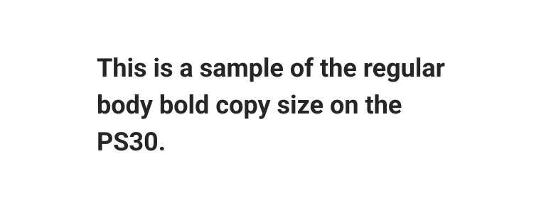
Body - Big screen
We’ve picked a larger default size for our body copy on the PS30 to improve readability for all users.

Body - Small screen
Due to the smaller screen size of PS20, to better accommodate content, we’ve picked up a slightly smaller body size

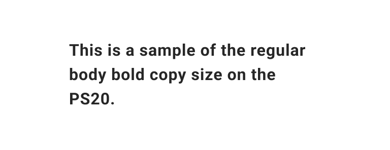
Caption
There are some instances where we use a smaller font size, such as for notes and legal text.

Intentional Guidance
For a service that supports over 100 million customers annually, even small improvements to clarity and usability can have a meaningful impact.
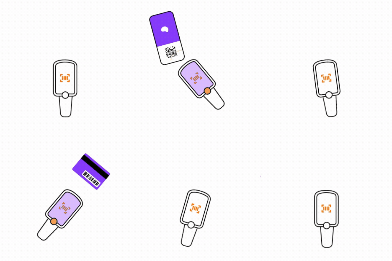
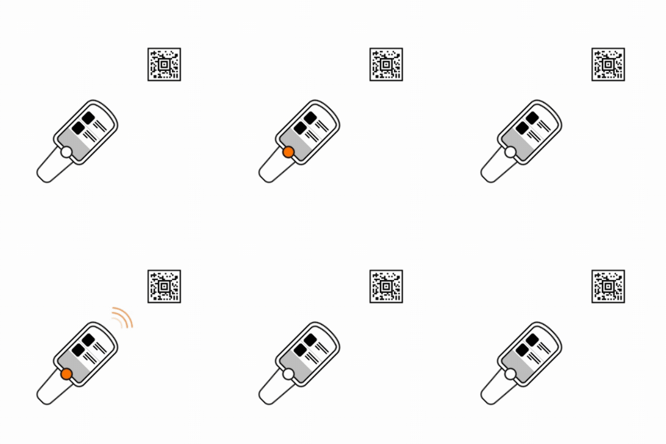
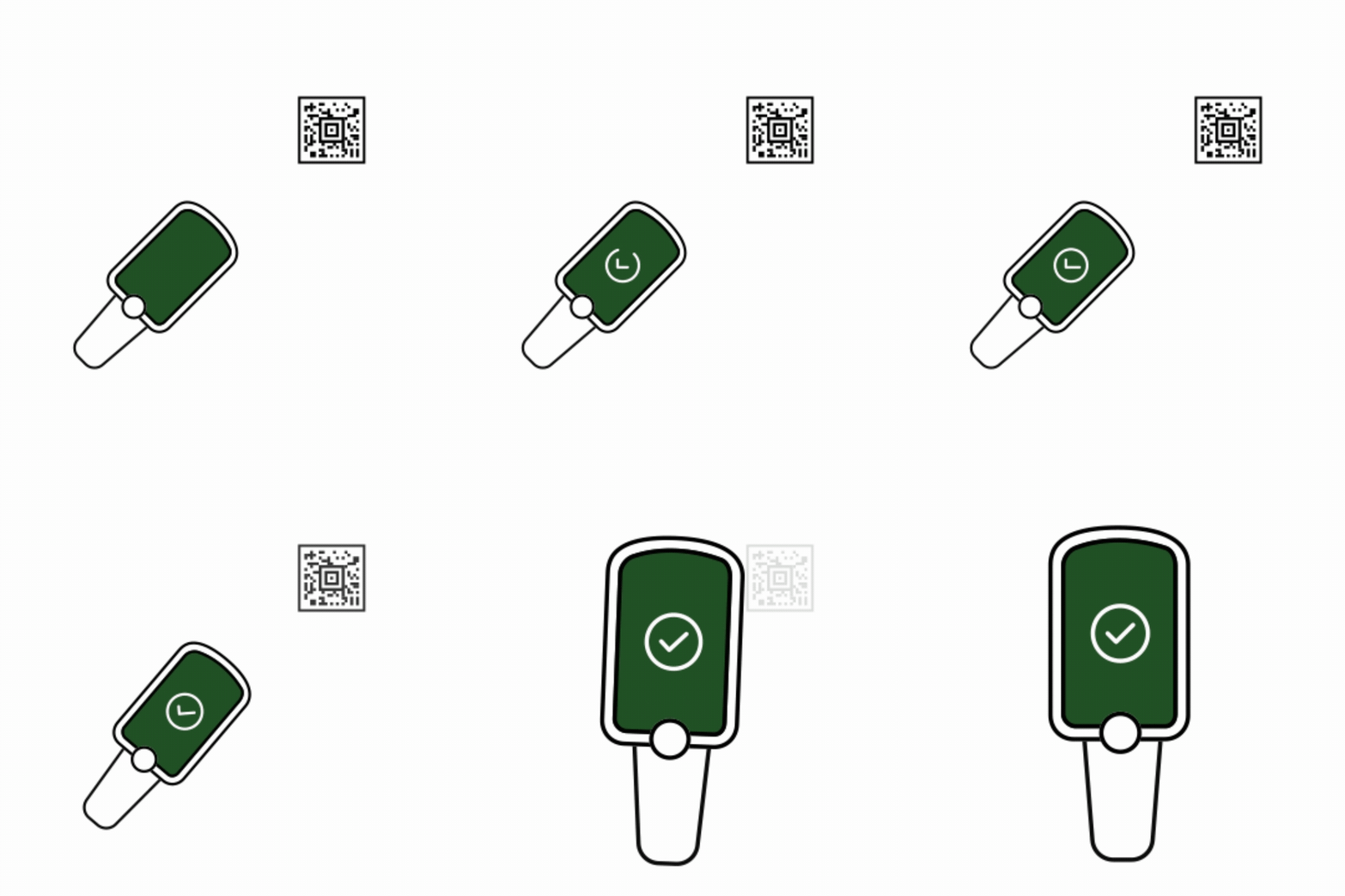
Using motion to bridge the gap between digital and physical shopping
Shopping with SmartShop isn’t a purely digital experience.
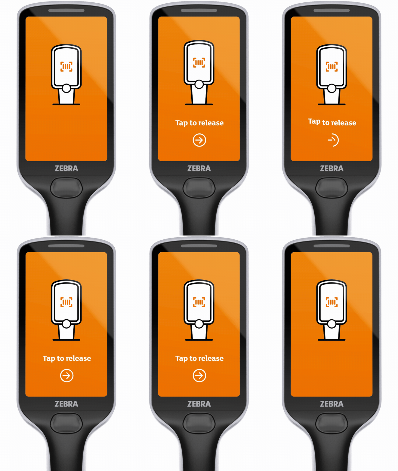
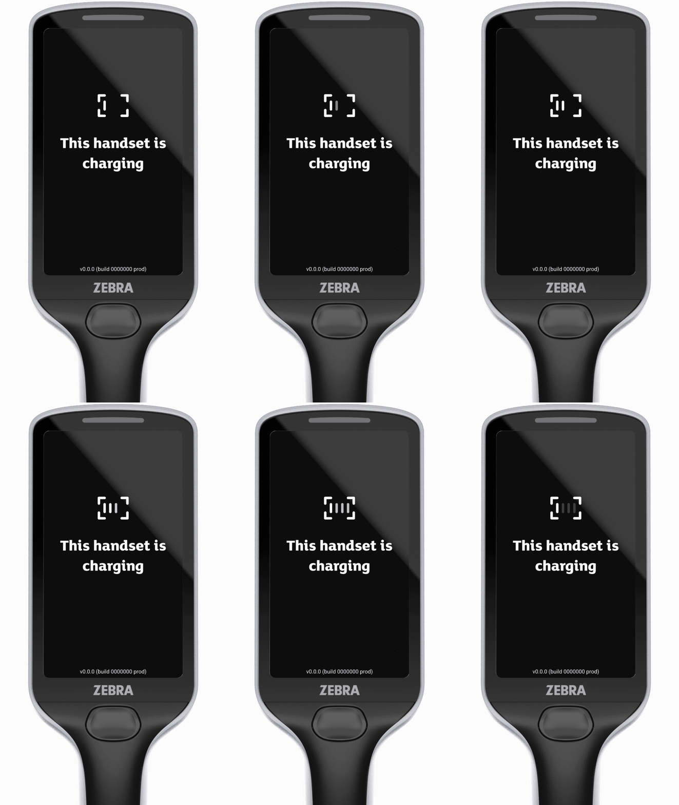
Throughout the refresh, we used motion to connect physical actions with digital outcomes. Rather than introducing animation for visual appeal, each motion pattern was designed to guide customers through key moments in their journey.
From onboarding customers to a handset to helping them understand when a scan is successful, motion became a lightweight layer of instruction woven throughout the experience.
When an action is easier to show than explain, show it.
Using sound and haptics to reinforce confidence
Shopping with SmartShop is built around a continuous conversation between customer actions and handset responses.
Every interaction with the handset became an opportunity to reinforce confidence through sight, sound and touch.
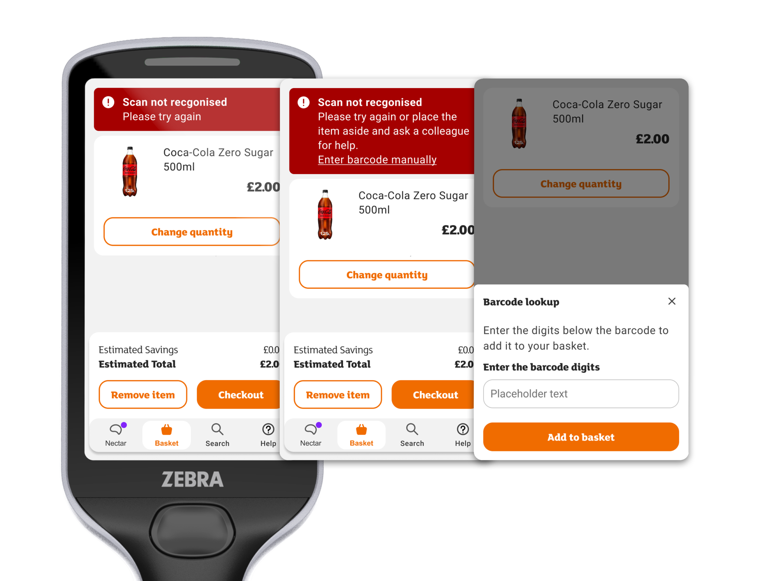
When something goes wrong, feedback becomes progressively more supportive.
Feedback shouldn't just acknowledge an action. It should help customers understand what to do next.
Spotlight
Reimagining the Basket
Bringing the Most Important Moment Into Focus
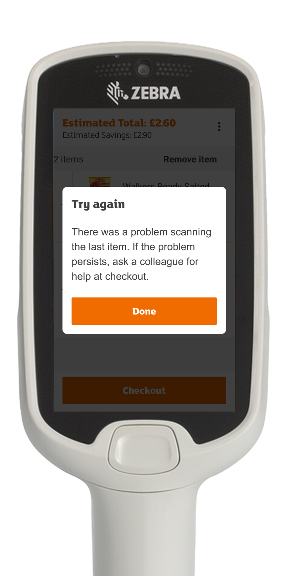
The basket sits at the centre of the SmartShop experience. Every scanned item passes through it, making it one of the most important moments in a customer’s shop.
Scanning a product is only half of the interaction. Customers also need clear confirmation that the system has understood their action.
Feedback should meet customers where their attention already is.
Before
Barcode error feedback
After
1st barcode error feedback → 2nd barcode error feedback → Barcode lookup feature
Keeping Actions Close to Context
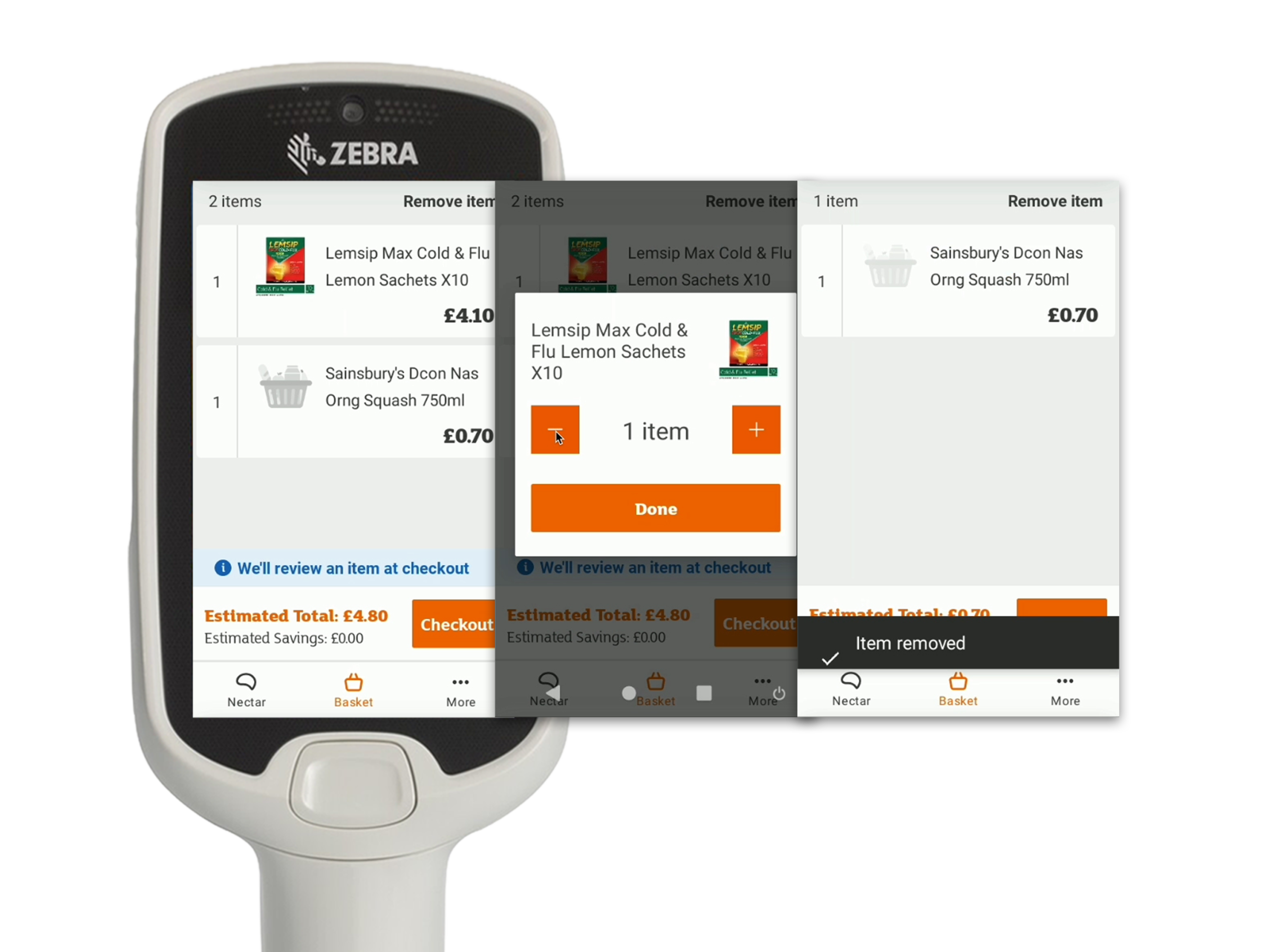
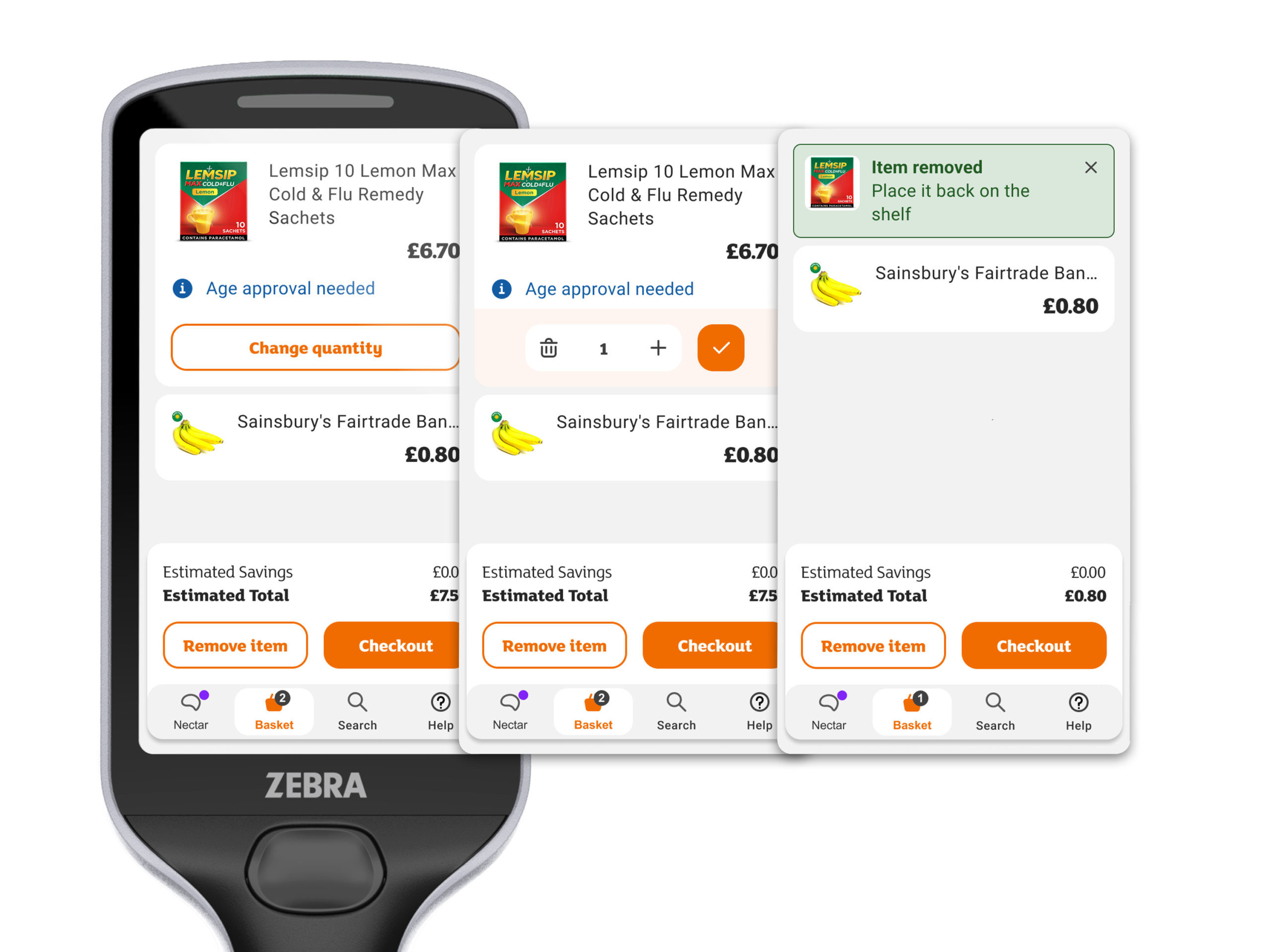
Changing quantity was one of the most common basket-management tasks, yet the controls were hidden behind additional interactions.
To strengthen that feedback loop, we gave greater prominence to the most recently scanned item, making it easier to identify, verify and review at a glance.
We brought these actions directly onto the basket item itself, making them available at the moment they are needed.
By keeping actions connected to the content they affect, customers can make quick adjustments without interrupting the flow of their shop.
Frequently used actions should live where customers naturally expect them.
Before
Scan an item → Change quantity / Remove → Item removed
After
Scan an item → Change quantity / Remove → Item removed
Building a Foundation for the Future
While the project began as a refresh of the customer experience, it also established a more consistent framework for future development.
The refresh created a shared set of patterns that makes SmartShop easier to evolve. Future improvements can now build on familiar behaviours rather than introducing new ones.
Consistency isn't just a design outcome. It's what makes future change possible.
Reflection
One of the biggest lessons from this project was that successful redesigns aren’t always about change.
For a product used regularly over ten years, familiarity is part of the experience.
The challenge was introducing improvements that customers would benefit from immediately, while ensuring the product still felt like SmartShop.
The most successful moments were often the ones that removed effort without drawing attention to themselves.