Fly UX | May 2020 - 6 months
Create a fast and intuitive online experience for a flight booking process.
Role.
UX researcher and UX designer.
Tools.
Sketch, Figma, ScreenFlow, Miro, InDesign.
Travelling has always been a part of human history.
Even if the pandemic put the travelling chance through the wringer, almost every person keeps talking about the importance of travelling. Indeed the travel industry has shown no bad signs. On the contrary, more and more people want to travel and they have an almost endless list of alternatives to fly at a cheaper price, everywhere and anytime.
During my professional course in UX design at UX Design Institute, I had the opportunity to design a new website for Fly UX, focusing specifically on the flight booking process – how users search for, find and select flights online – and creating an experience that is fast, easy, and intuitive, based on a deep understanding of their target users.
Problem.
Unfortunately, quite often booking a flight can be a frustrating, time-sapping endeavour, and that has a huge influence on the purchase choices of customers.
How might we optimise the online booking process to ensure confidence and perceived ease of use for customers?
"By delivering the right information at the right time, we can deliver greater value to our users and our partners. The data has shown that users are willing to pay more to get more – even for something as simple as a better booking experience."
— Faical Allou, Senior Commercial Manager at Skyscanner.
Goals.
As a researcher, I conducted quantitative and qualitative researches to build a deep understanding of the users – their needs, their habits, the tools they use, their experience and their feelings – and identify from existing airline booking processes what competitors are doing right, and learn from what they are doing wrong.
Through the research, I acquired a large amount of raw data and I identified the critical areas and the problems that FLY UX should be solving for users to design a smooth and pleasant experience.
As a designer, I laid the groundwork of the new airline website by defining the high-level flow for booking flights and sketching the screens and screen states to fix the issues and user goals uncovered in the research and analysis.
I created a prototype to make ideas tangible, adding more details on the main sections and the core interactions within each page.
I iterated into the loop of prototyping and getting feedback by testing over time for improvements to validate the value of Fly UX features.
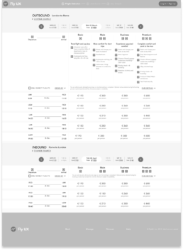
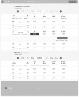
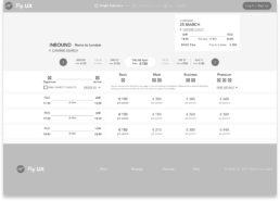
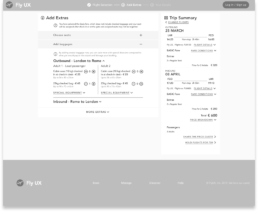
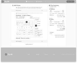
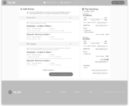
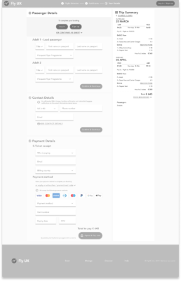
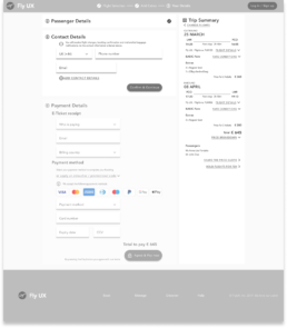
I defined and annotated all the necessary details creating the wireframe for the developers to build the website accurately
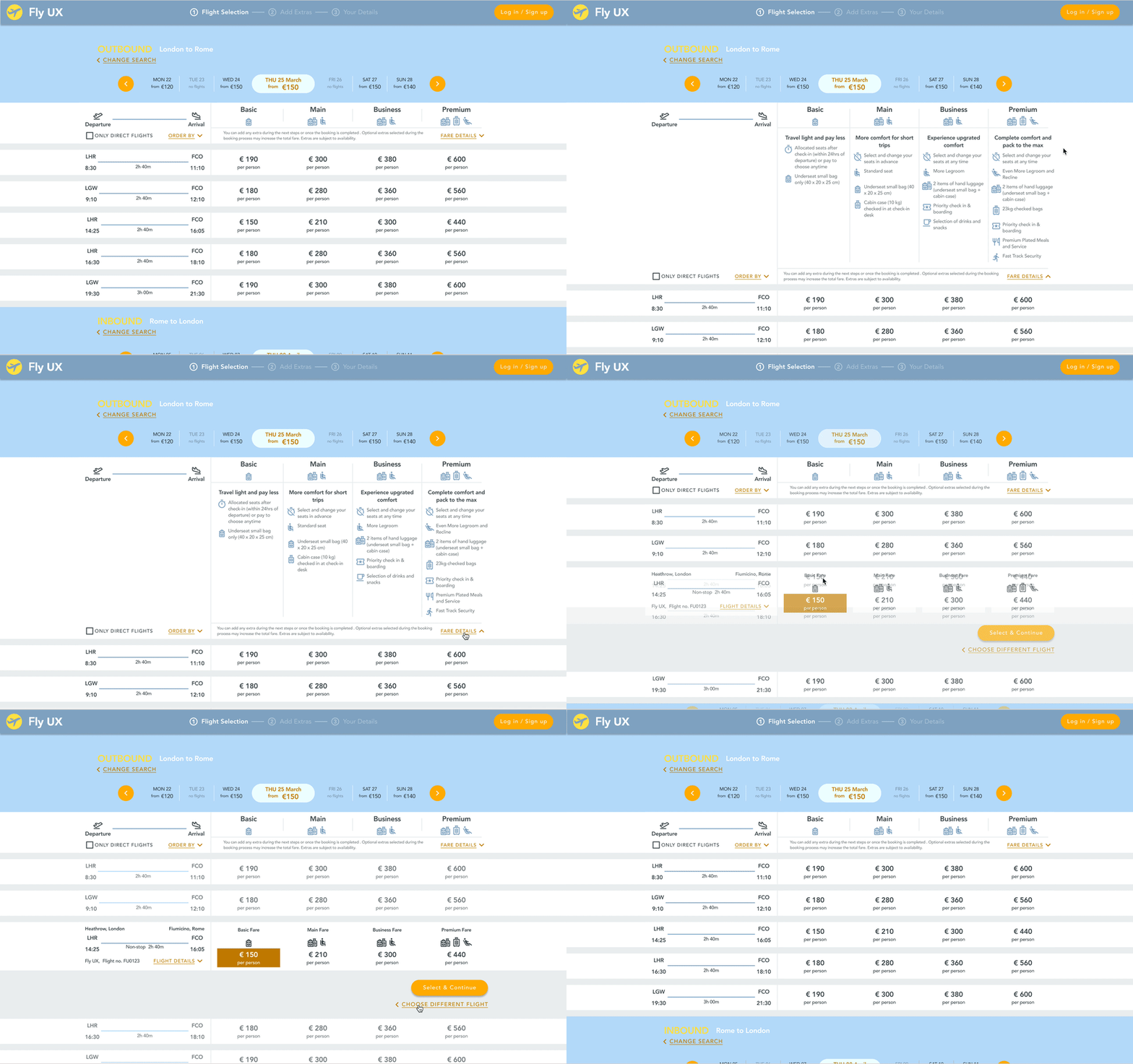
01. Flight selection
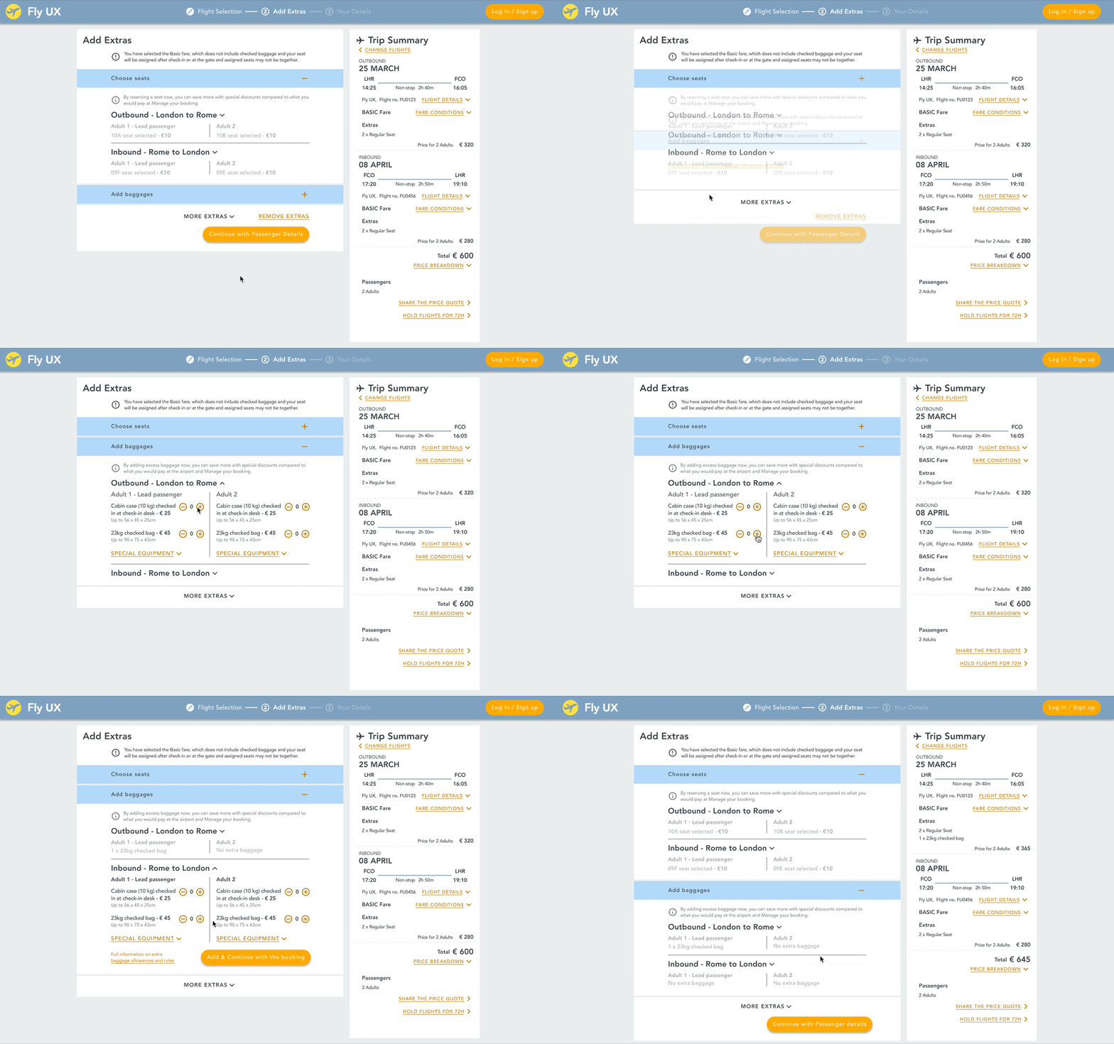
02. Add extras
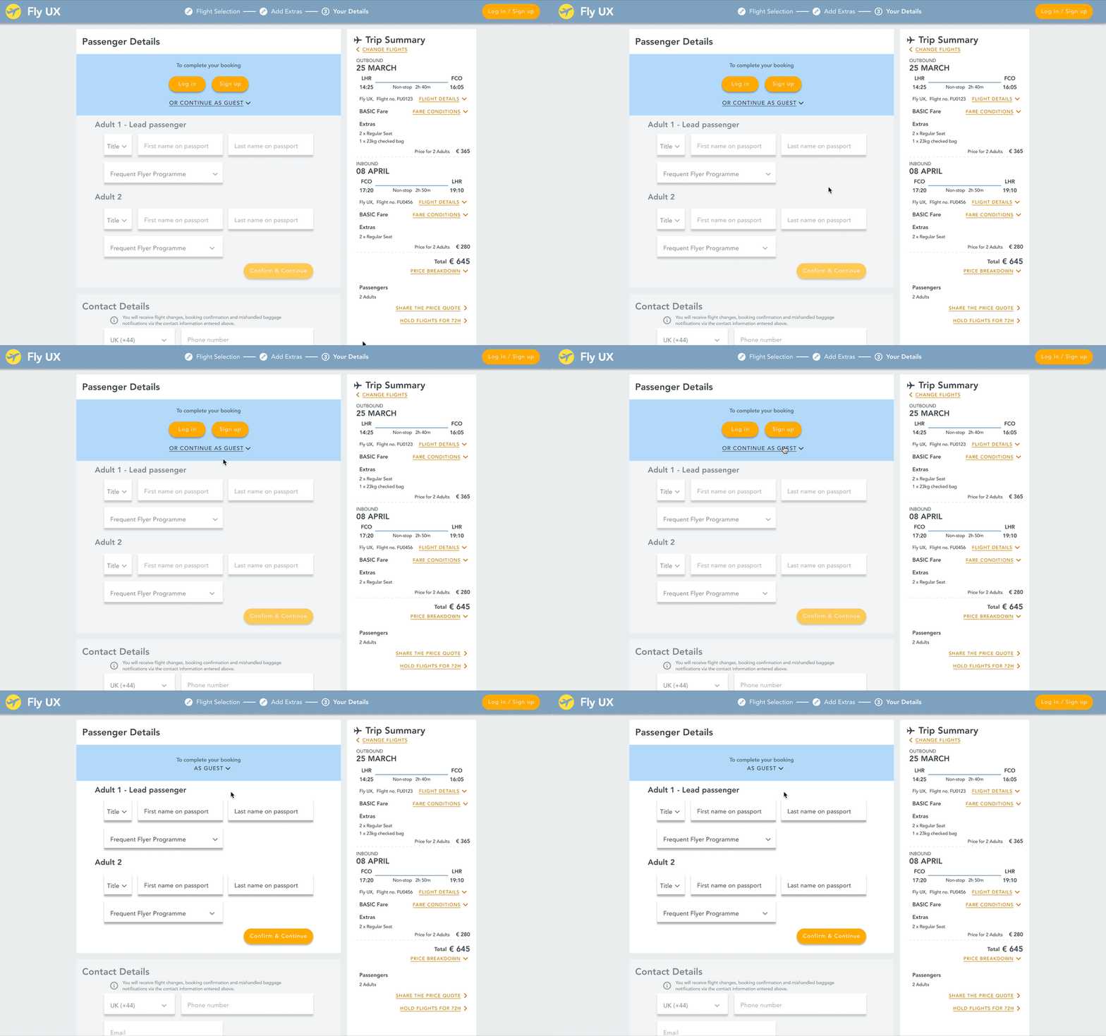
03. Add Personal details
Learnings.Takeaways.
Don’t need to reinvent the wheel. Users don’t care about software products, they only care about what the product can do for them. Taking a good look at competitors and similar patterns is a good practice. Users need a product that they can trust, not a product that is a unique piece of art.
I am not the target audience. What a user thinks they will do, what they say they will do, and what they actually do, are very different things. The research phase provided me with unexpected insights that I wouldn’t otherwise have considered. The interaction with real users made me realise who I was designing for, open my mind to them but remain objective throughout the process.
Work efficiently and know when to stop. Determine the level of detail a prototype needs for the problems to be addressed and to be successfully tested. Don’t waste time and resources by over-designing aspects of the prototype that won’t be tested.
Document as much of the work process as possible. It’s not only helpful during the process to step back and double-check why I moved in a certain direction instead of another one. But it is also very valuable in the next stages, that is the final presentation or talking about it, and last but not least see where to improve me.
Full process deck
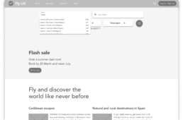
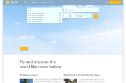
Understand
Competitor Benchmarking.
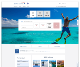
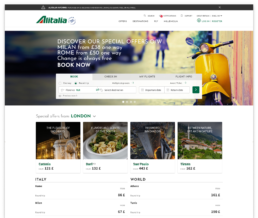
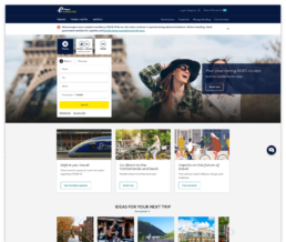
During the Competitive Benchmarking research, I reviewed four online airline websites and benchmarked them by taking screenshots from each stage of the journey, to highlight pros & cons aspects so I could emulate them in the right places and avoid the pitfalls I discovered in their booking process.
Understand
Usability Testing.
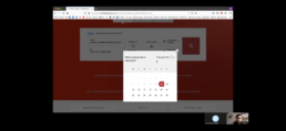
I created a recruitment screener, a consent form and a script for desktop usability testing sessions. I conducted 4 Usability Tests which consisted of an interview and the completion of tasks on 2 Airline online websites. This would allow me to make an accurate comparison between the websites and learn about user attitudes towards, and management of tasks. I used Screenflow to record the session.
Understand
Depth Interviews.
Depth interviews I conducted during the Usability Testing, gave me a better understanding of the user flows through the journey and the context of the use of people that use airline booking – what are they trying to do, who are they with, where are they, what devices are they using.
Understand
Online Surveys.
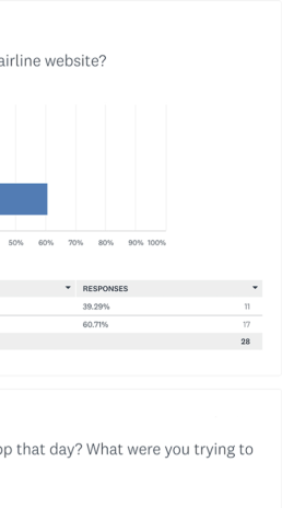
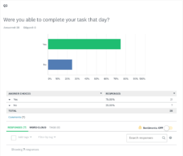
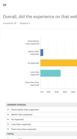
I prepared an online survey using SurveyMonkey to collect additional data that was completed by 28 people. To get the maximum response, I outlined that there were just 10 questions, both open and closed as well as some multiple-choice questions, and it would only take 3 mins to understand user habits, the tools they use and their challenges.
Understand
Affinity Diagram.
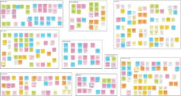
The analysis phase begins with synthesis, reviewing all the data that I had compiled, taking turns pouring key information out and downloading it onto Post-its. I identified patterns and themes and I clustered them into categories. The goal of the affinity diagram was to identify the features that would be core to addressing user needs and helping optimise task management.
Understand
Customer Journey Map.
I took the information from the affinity diagram and define the high-level steps in the journey to show how the experience was at each stage and document the context, the goals of the user, whether there were any pain points, and if there were any behaviours that the website was not facilitating.

Findings.
The key insights I gained by using these research methods include:
Tasks. Go through the steps quickly and easily to finalise the booking; Share flight results; compare flight results.
Pain points. Search functionality is not just a “handy feature”, it’s what the user expects; Chaotic booking process and not transparent communication reduce the trust; lack of holistic experience.
Behaviour. Use multiple websites to compare the offers; focus on price; Lack of attention to details.
These insights allowed me to further define the project problem.
Design
Flow diagram.
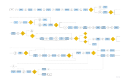
I created a high-level Flow Diagram to address issues highlighted in my Customer Journey Map.
I sketched out the general flow of one primary use case, the problem statement related, getting very granular and going back and forth to ensure that the user’s pathway was as clear, and intuitive, as possible. I then translated my sketches to digital format using Sketch. During the translation, I iterated into the flow as I worked and learned more about the journey.
Design
Information architecture.
The idea was to have a primary and a secondary navbar that is displayed at all times. After the user selects both flights, a clickable progress bar appears into the navbar instead of the primary nav, to indicate how much is left to complete and to allow the user to go back to the previous steps.
Design
Interaction design.
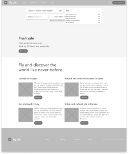
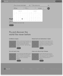
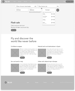
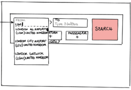
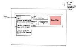
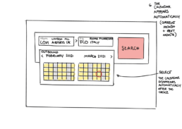
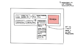
I defined a list of screens to design based on the flow diagram, screen state included if necessary, and I sketched out each screen/interaction on individual pieces of paper, several times. This allowed me to rapidly iterate, and craft a solution that worked to guide users to their goals. Creating low fidelity wireframes also ensured that chosen solutions worked well on screen and integrated seamlessly with one another.
Design
Mid-Fi Prototype.
I created a medium-fidelity prototype using Figma for screen layouts, text, and basic interactions, developing a minimum viable product in order to prepare and conduct a new Usability Testing to validate the user flows, identify any usability issues, and identify creative optimization approaches.
Deliver
Wireframe.
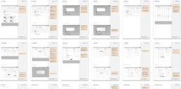
One of the final deliverables for Fly UX, was to annotate all the specifications, rules and feedback and make the document, in order to communicate clearly with the developers what exactly to build.

